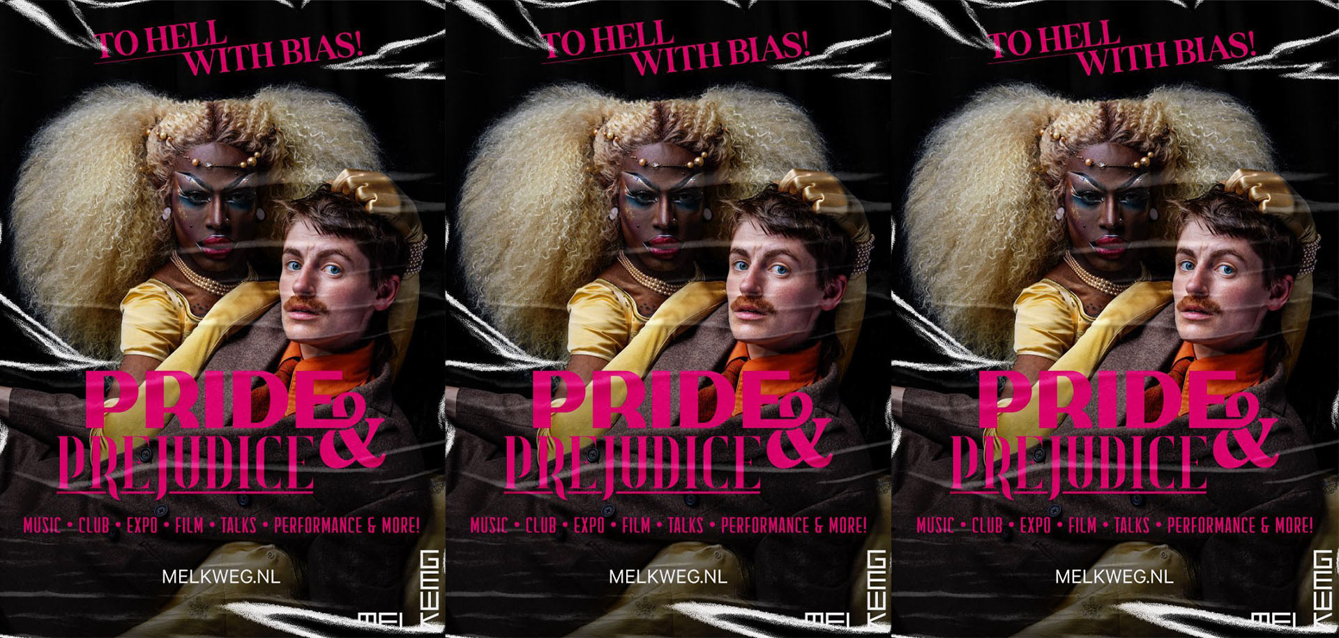
For Melkweg’s Pride Campaign, I developed a visual identity and design toolkit that could be used consistently across the campaign.
Melkweg was looking for a designer from within the queer community who could bring a playful, colorful and expressive visual language to the project. I translated that direction into a flexible identity that felt celebratory and energetic, while still working clearly across different formats and applications.
The project gave me the opportunity to bring more of my own playful visual style into a broader campaign system, creating a toolkit that could be used across both digital and physical touchpoints.
Built around the theme “PRIDE & PREJUDICE: To hell with bias!”, the campaign challenges stereotypes through a bold and inclusive visual language.
References to Pride are combined with the visual world of period dramas such as Bridgerton and Jane Austen, creating an unexpected contrast between tradition and self-expression. I translated this into a flexible system of recognizable graphic elements that could be mixed and matched across different campaign formats.
The visual identity is intentionally bright and colorful without relying on the traditional rainbow, creating a Pride campaign that still feels expressive and celebratory while having its own distinct character.
Designed to work across multiple platforms, the identity could be applied to posters, digital assets, social content and other campaign materials, while still leaving room for more in-depth stories and voices from within the community.