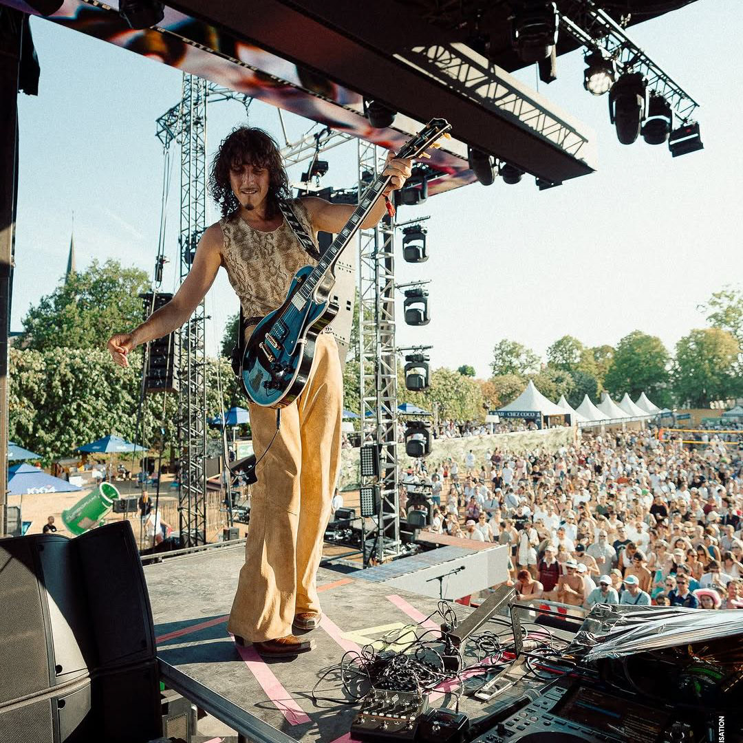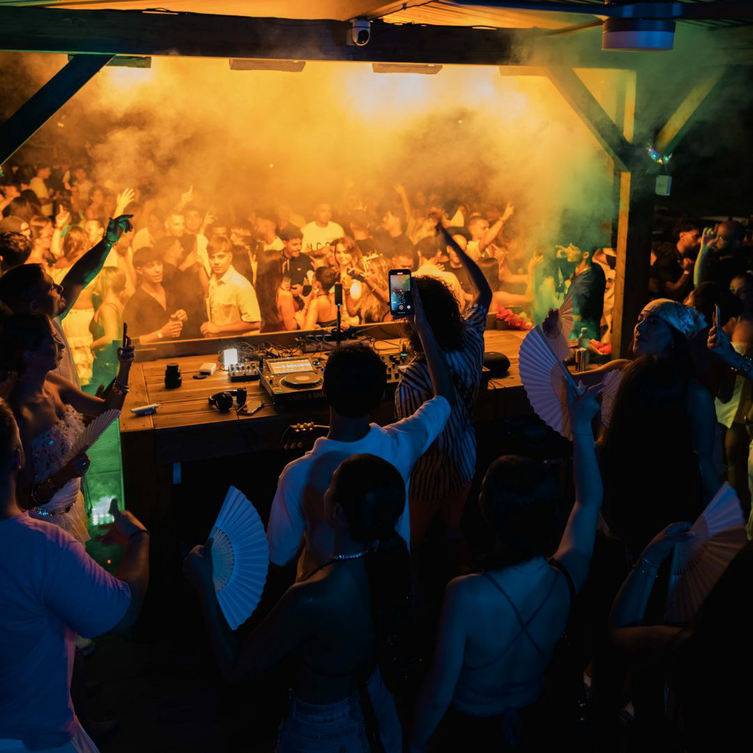
Ginton is an Amsterdam-based platinum DJ, producer and guitarist, known for his work with artists such as Drake, Koffee and Stonebwoy. In 2024, he founded his independent label Woody Trees together with his manager Rodney Kolf.
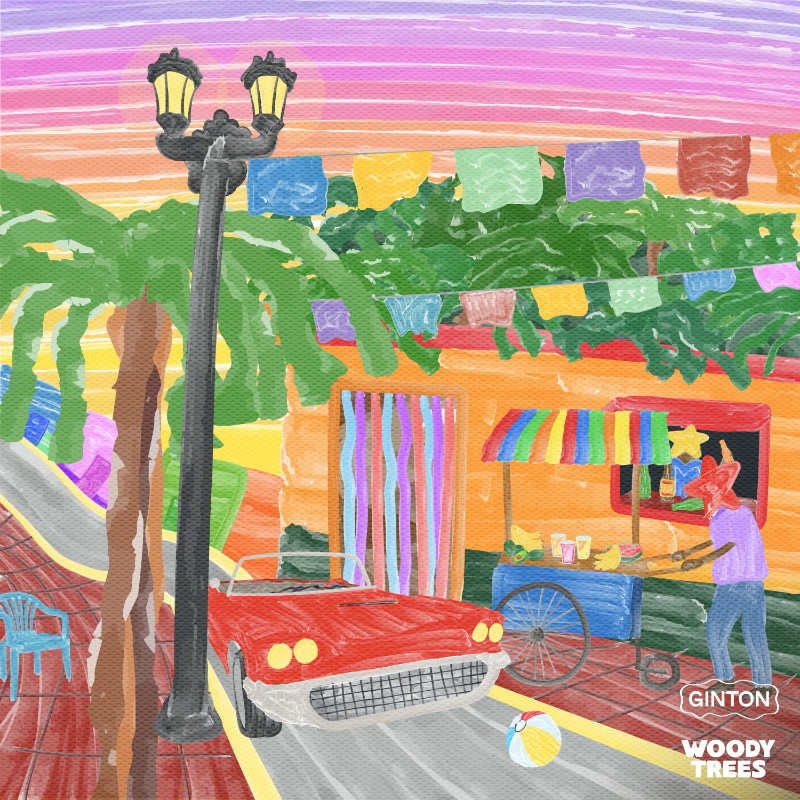
I have been involved in Ginton’s visual identity from the beginning, working closely with him to shape and develop the look of his releases over time. Together, we built a recognizable artwork style that has grown into a playful and colorful visual language, giving his music a distinct and consistent identity.
Alongside his artist branding, I have also contributed to shaping the visual direction of Woody Trees, helping establish a foundation for the label as it continues to grow.
ARTWORKS
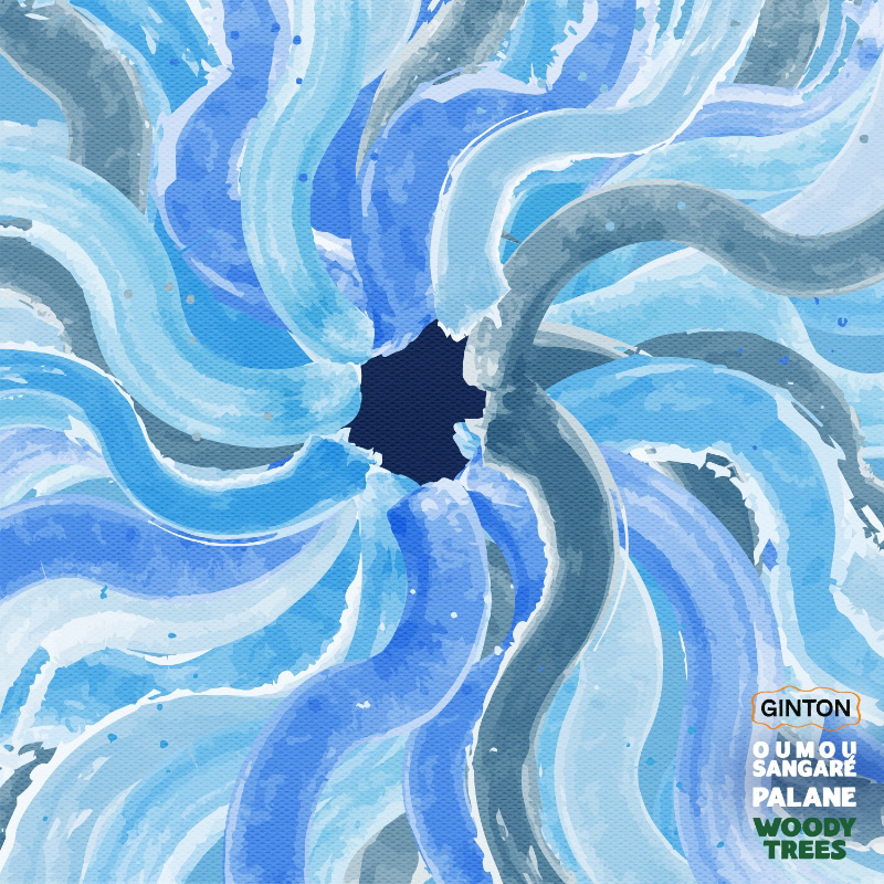
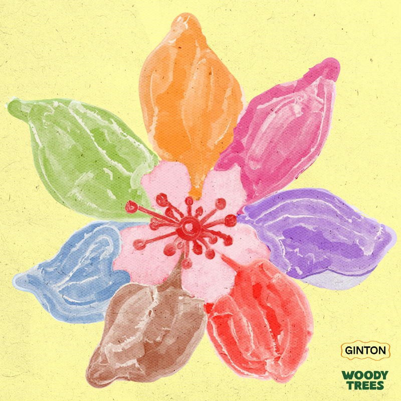
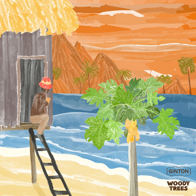
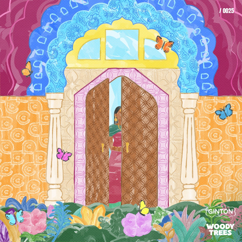
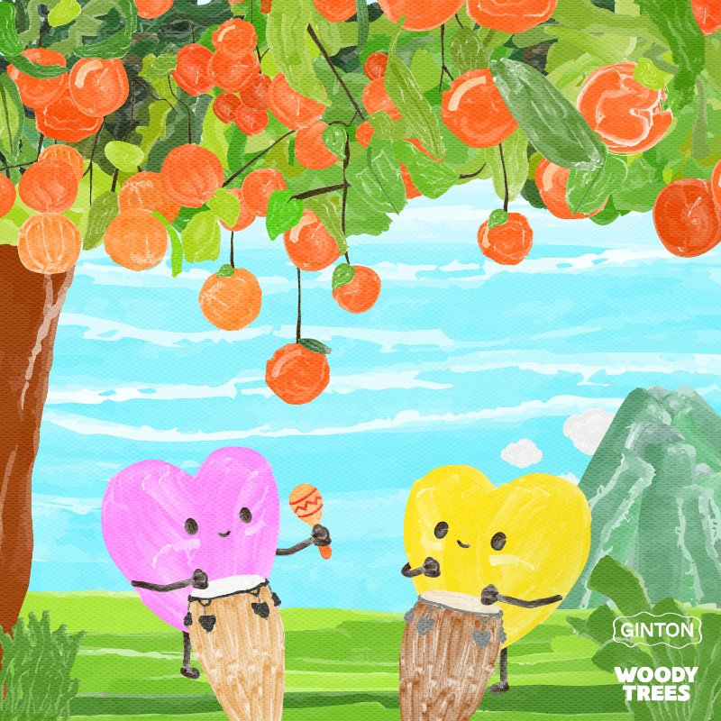
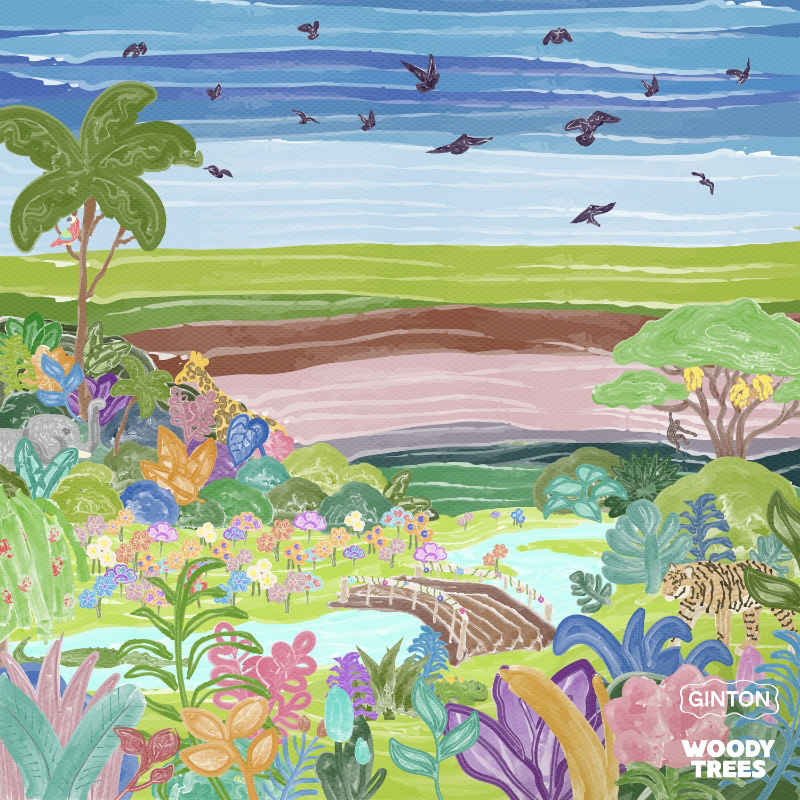
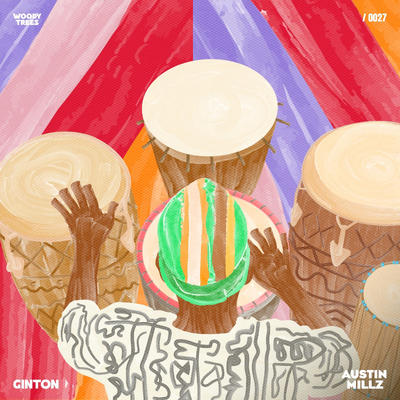
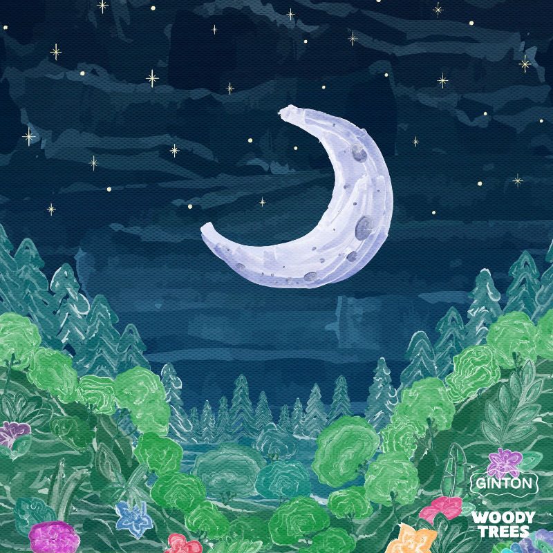
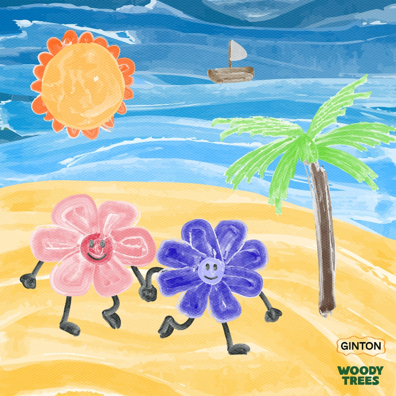
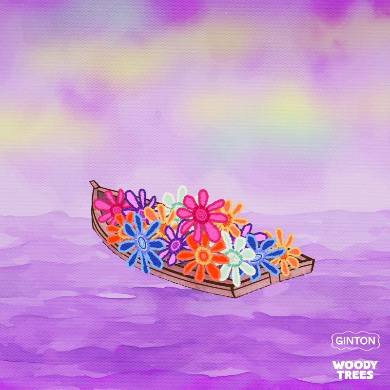
The artworks are always drawn digitally from scratch and built around a colorful, playful visual language. They often take place in tropical or dreamlike settings, using bold characters, simple shapes and expressive details to create a world that feels lighthearted and full of personality.
A painted, slightly imperfect texture runs throughout the work, giving each artwork a tactile and handmade feel despite being created digitally. By combining these recurring elements, the releases have developed a recognizable visual style that feels closely connected to Ginton’s identity as an artist.
LOGO
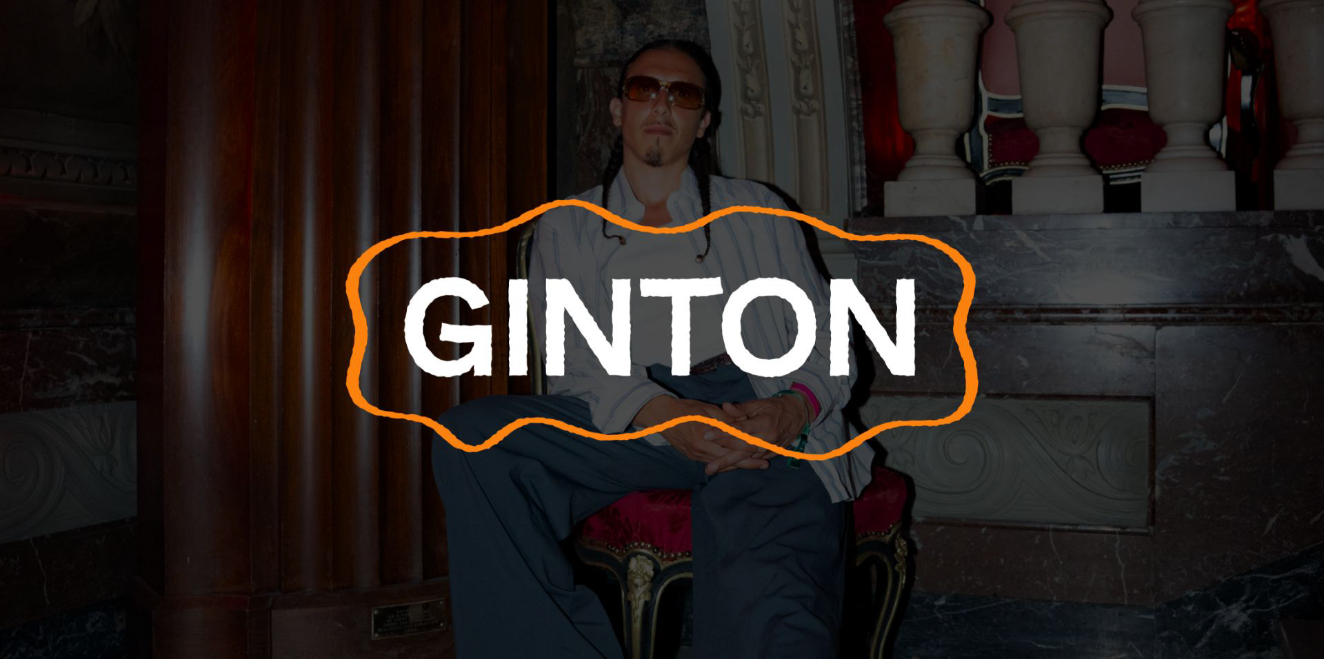
The logo was designed to reflect the same playful and colorful character as Ginton’s overall visual identity. Instead of using perfectly clean shapes and typography, I introduced subtle irregularities throughout the design.
The orange outline has a loose, wavy shape, while both the lettering and linework have a slightly rough finish. This gives the logo a more organic and handmade feel, helping it connect naturally with the illustrated artwork style while still remaining simple and recognizable.
WEBSITE
I designed Ginton’s website as a digital extension of his visual identity, translating the playful and colorful character of his artwork into a clear and engaging online experience.
I was responsible for the UI/UX and visual design, keeping the interface intentionally clean so visitors can quickly find what they are looking for, whether that is music, tour dates, the shop or contact information. The warm orange from Ginton’s identity is used as a recurring accent, while full-screen video gives the site energy and lets his performance and personality take center stage.
The website was developed by Dion Dijkstra, who translated the design into the final working site.