During my time at the BNNVARA Academy, I created a new visual identity and motion package for at least one online video each week. Working from scripts, I translated a wide range of subjects into title design, animation and visual assets for digital video content.
The variety gave me the opportunity to explore a different visual direction every week, while making sure each identity supported the story and tone of the video. Although I already had experience in graphic and motion design, the Academy taught me to think more editorially, design specifically for online formats and take greater ownership of my role within a production team.
I became more confident presenting ideas, sharing my perspective and collaborating with editors, producers and other creatives. Above is a short showreel featuring some of my favourite Academy projects. Below, I highlight the process behind a selection of individual videos.
A Week Without Waste
This video follows Sonja as she attempts to live for an entire week without producing any waste. The experiment shows how difficult zero-waste living can be in a society built around convenience, packaging and disposable products.
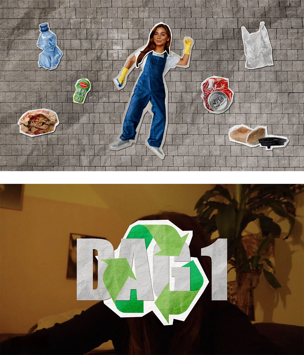
For this project, I wanted to try a different visual direction from the more typography-driven work I had created before. Because the subject centred around waste, I developed a collage style using cut-out objects, scraps and crumpled-paper textures.
For the introduction, I deliberately avoided using text. Instead, I communicated the concept visually by bringing different pieces of waste into the frame as cut-outs and transforming them into crumpled paper. This allowed the theme of the video to become clear through motion alone.
I also designed recurring transitions to indicate each new day of the challenge. These followed the same visual language, with the day placed inside a recycling symbol. The transitions created a consistent structure throughout the video and helped guide the viewer through the week.
Watch the full video on YouTube ↗
The Comeback Challenge
In The Comeback Challenge, two teams are dropped in the Dutch countryside without money or phones and have to find their way home using whatever form of transport they can arrange along the way.
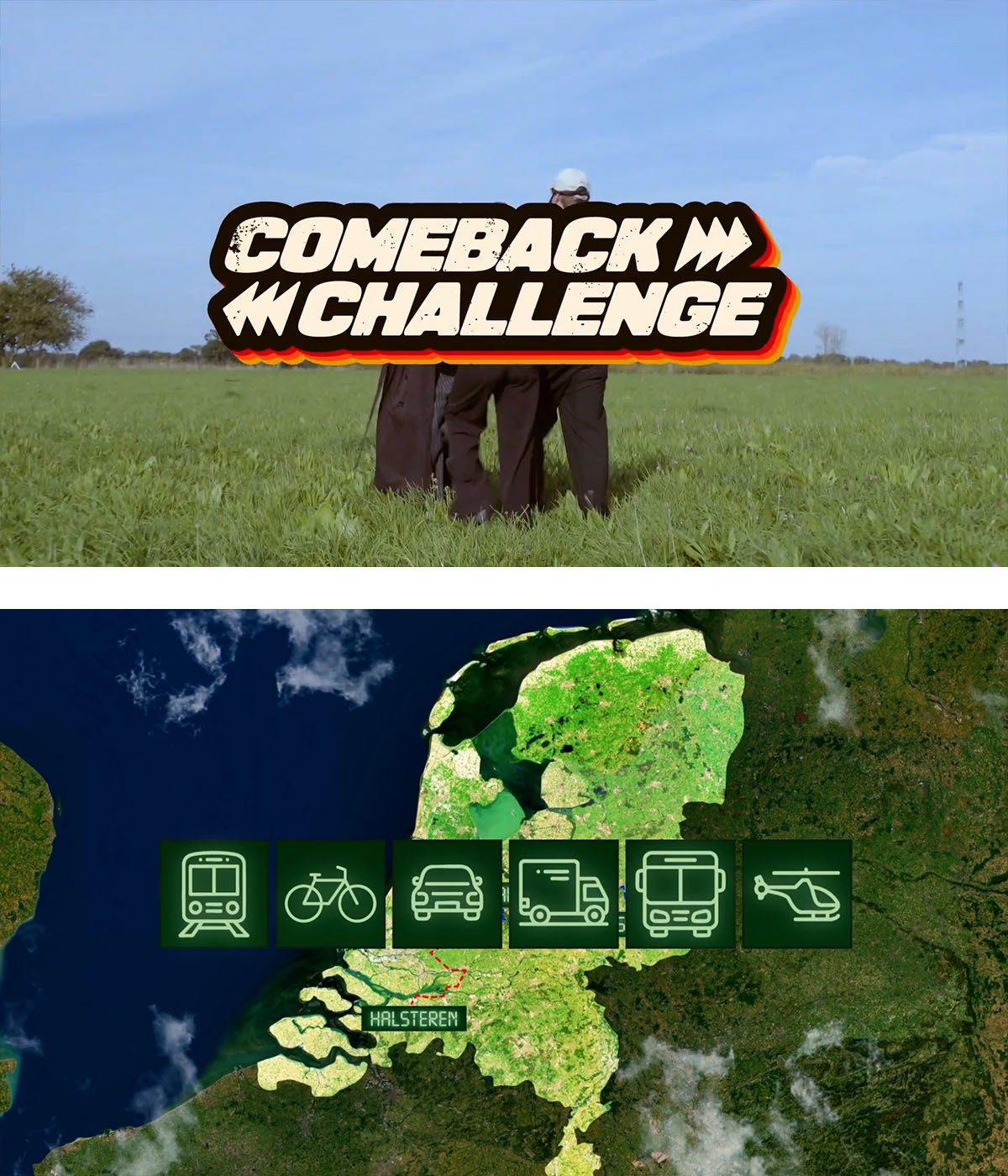
This was one of the first Academy projects where I had the opportunity to create a wider range of supporting motion assets. A key element was an animated map showing where each team was located in the Netherlands and how they were travelling.
To give the map more depth and movement, I added layers of clouds and animated it with a subtle floating motion, creating the feeling of flying above the route. Combined with location updates and animated vehicle icons, this helped maintain a sense of progress and suspense throughout the video.
I also created graphics for the opening explanation of the rules, supporting the information on screen and introducing the challenge in a clear and engaging way.
I was also asked to join the production as a camera operator, following one of the teams throughout the challenge. I really enjoyed getting the opportunity to be part of the shoot as well as the visual development of the project. I’m always happy to contribute wherever needed, and this experience reflects the flexibility and hands-on attitude I bring to collaborative productions.
Watch the full video on YouTube ↗
Cancel Culture
This panel discussion explored cancel culture within the hip-hop scene, looking at public accountability, freedom of expression and whether artists can recover after being cancelled.
This was one of my favourite Academy projects because the visual direction was clearly developed together with the team before production began. We wanted the identity to feel bold, raw and closely connected to hip-hop culture.
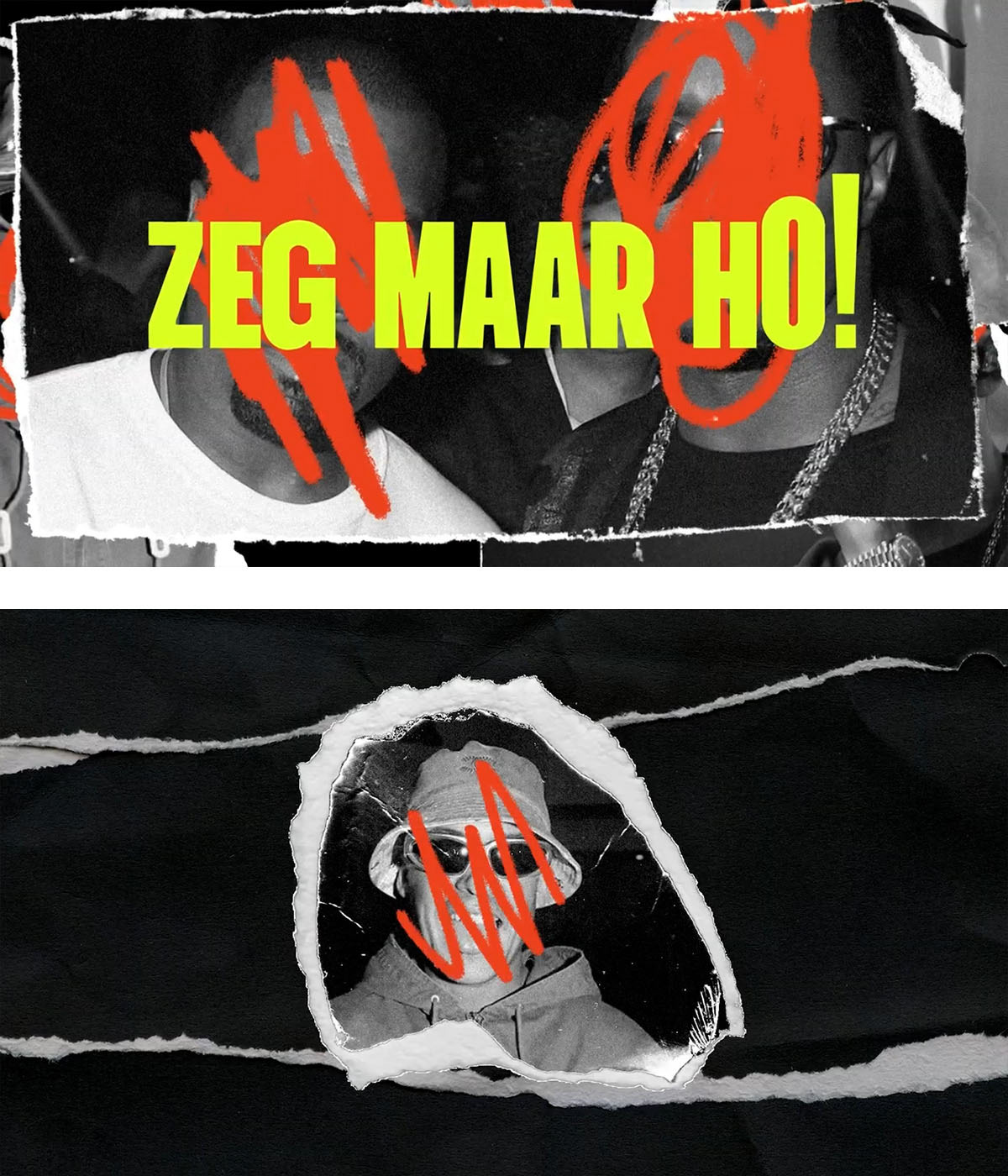
I created a torn-paper collage style, presenting the featured artists as if they had been ripped out of a magazine after being publicly cancelled. Their faces were crossed out with rough red-pencil marks to reinforce the feeling of rejection and public judgement.
The transitions use camera flashes and shutter sound effects, referring to celebrity culture and the constant attention placed on public figures. This also supported the idea that artists in the spotlight are often expected to act as role models.
Compared with some of the other projects I created during the Academy, this identity felt especially cohesive. Because the concept and visual language were established early in the process, every design and animation choice contributed to the same central idea.
Watch the full video on YouTube ↗